Pantone just released their spring 2016 colour report, you’ll want to wear all of their selected shades (maybe even in one outfit). The colours are bright but still manage to perfectly embody that ease and pastel vibe that’s always associated with spring. Scroll on down to check out the ten colours they think will be big in the coming months.
Rose Quartz: PANTONE 13-1520 This tone, which Pantone describes as soothing and “persuasive yet gentle” is a cool shade that’ll work flawlessly from spring to summer. Rose Quartz reminds us to reflect on our surroundings during the busy but lighthearted spring and summer months. This is one of the selected Pantone’s colour of year 2016.
Peach Echo: PANTONE 16-1548 Think of Peach Echo as Rose Quartz’s crazy cousin. This colour has the same blushy undertone but is definitely bolder and slightly more orange.
Serenity: PANTONE 15-3919 Weightless and airy, like the expanse of the blue sky above us. Serenity is A transcendent blue, Cool and clean, this soft shade will work great on everything from a flowing midi skirt to a structured crop top. This is one of the selected Pantone’s colour of year 2016.
Snorkel Blue: PANTONE 19-4049 This maritime-inspired shade definitely falls in the navy family but with a happier, more energetic context, than the standard version of the colour. It is striking yet still, with lots of activity bursting from its undertones. We’re guessing this is one colour we’ll be seeing a lot of come red carpet season.
Buttercup: PANTONE 12-0752 Forget that mustard yellow you’ve been seeing for years. This brighter alternative offers a little bit more vibrancy and life without being too over the top. Buttercup, is transporting its wearer to a happier, sunnier place.
Limpet Shell: PANTONE 13-4810 This shade of aqua, which borders on the green family, is clear, clean and defined. This crisp colour would look great on some structured trousers or maybe even an anorak-style spring jacket.
Lilac Grey: PANTONE 16-3905 Is it purple or is it grey? It’s neither and both at the same time. Essentially a basic, the subtlety of the lilac undertone. Looks like we just found our new favourite neutral.
Fiesta: PANTONE 17-1564 If you’re ready to amp up the drama, rocking this shade is a sure-fire way to do it. A strong and fiery, yellow-based Red, the vivid Fiesta provides a stark contrast to the calming, softer nature of this season’s palette.
Iced Coffee: PANTONE 15-1040 If you’re ready for another alternative neutral, look to this soft shade of brown. With its natural earthy quality, the softness and subtlety of Iced Coffee creates a stable foundation when combined with the rest of this season’s palette.
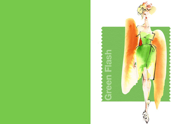
Green Flash: PANTONE 15-0146 Similar to chartreuse, this bold shade of green is definitely vibrant, it calls on its wearer to explore, push the envelope and escape the mundane. Pantone says " The popularity of this brilliant hue is representative of nature’s persistent influence even in urban environments, a trend continuing to inspire designers."
What’s your favourite colour from this fresh palette? Share with us in the comments below.


0 comments:
Post a Comment